With Fusion UX Logic, clients can now integrate custom UI components into predefined places in their Uptempo system.
Possible functionalities easy to implement with custom components are:
- Pulling additional information from 3rd party applications and displaying them
- Showing that Fusion UX Apps can execute lookups, e.g. in external databases
- Integrating a Lickert Scale or other evaluation questionnaires
- Showing that Fusion UX Apps can write back results with the help of functions provided by the page slots
- Visualize existing information in customized component
- e.g. with the help of charts
Web Components serve as the technical foundation. Besides the initial component, a Fusion UX App also consists of a set of configuration values collected in a Manifest file.
Fusion UX Apps are both registered and managed in the administration of the Uptemp osystem.
Structure of the administration
Within the administration module, custom components are managed under 'Fusion/UX Logic'. There they can be registered, installed, and adapted.
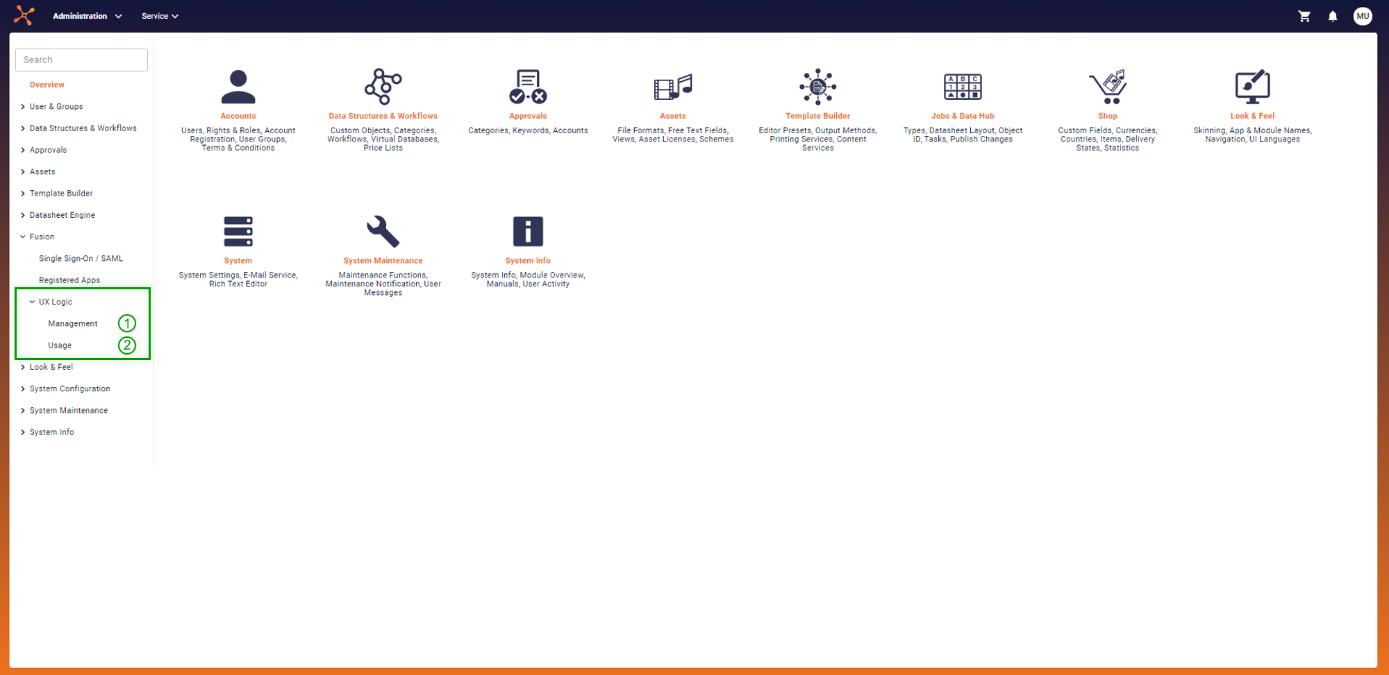
(1) Management
The scripts for the Fusion UX Apps are managed in the section 'Management'. This administration includes the registration of new component scripts and adaptation of existing ones.
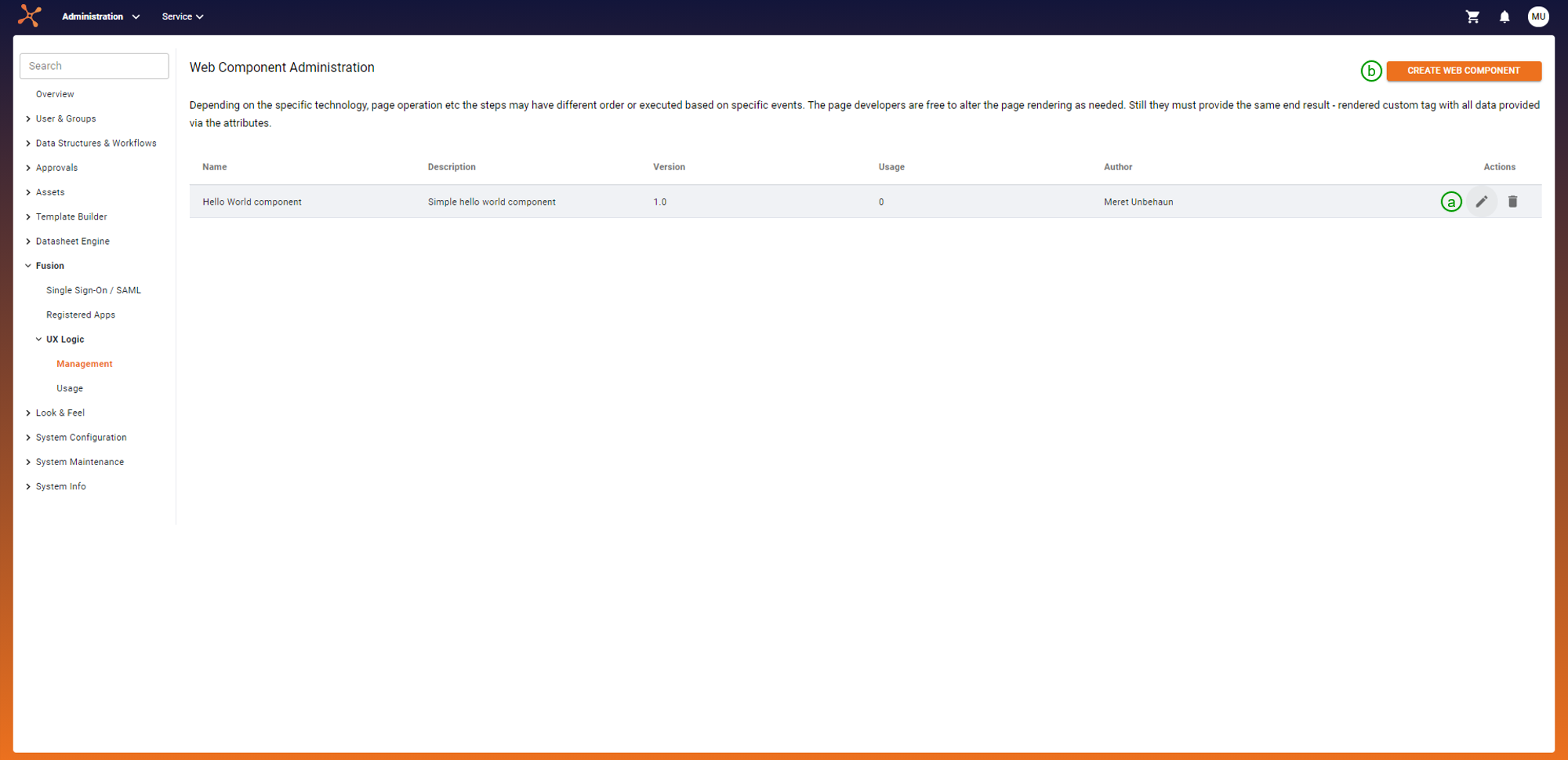
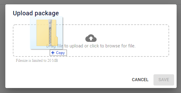
(a): To register a new Fusion UX App, click on 'CREATE NEW COMPONENT'. In the opened dialog, upload the corresponding ZIP file containing the source files.
The Uptempo system examines the uploaded files to ensure integrity and security. If the validation passes, a unique ID and URL will be created. By fetching the component through this URL, the system can then integrate the Fusion UX App.
(b): To edit a script, click on the corresponding table entry. The opened page shows the metadata and attributes of the component. The page only displays these values. To adjust them, alter the source files and re-upload them. If the component is already integrated into the system, make sure the attributes still work with the defined usages or adjust the usage definitions accordingly.
(2) Usage
In this section, the actual usage, meaning the integration into the Uptempo system, is defined and managed. This definition includes where (placement) and how (configuration) the component is rendered.
Module, page, and a predefined slot within the module define the placement. Important to notice, one place can only have one associated usage at a time.
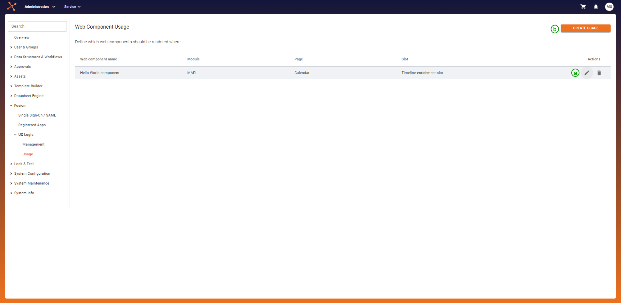
(a): To add a new placement-configuration combination, click on 'CREATE USAGE'. In the opened dialog, choose a registered component (can be both predefined by Uptempo or own custom component) and select the module, page, and one of the predefined slots later displaying the Fusion UX App.
Configure the attributes of the chosen component by setting a default value or assigning them to a slot attribute provided by the selected slot.
(b) To configure a usage, select it in the table, which opens the same dialog shown under (a).
Development of own custom component
Web Component Basics
The components use Web Components as a technical foundation.
A minimal component, only displaying HELLO WORLD!, would look like this:
// template for the custom component
const template = document.createElement('template');
template.innerHTML = `<h1>HELLO WORLD!</h1>`;

export default class HelloWorldComponent extends HTMLElement {
    constructor() {
        super();

        // need to attach a shadow DOM (returns the ShadowRoot)
        this._root = this.attachShadow({ mode: "closed" });
        this._root.appendChild(template.content.cloneNode(true));
    }
}
To formalize the setup, hybrids can be used as an abstraction layer.
Specifics for BrandMaker
Components are not completely static. Instead, they have a set of configuration values. These settings are not hard-coded into the component but described in a Manifest file and adjustable in the administration.
Exemplary configuration values are
- target URLs of REST API to fetch data
- credentials to log in
- UI settings like colors
- images
Structure of ZIP file
A Fusion UX App consists of:
- the initial Web Component (needs to be called '
BmFusionAppComponent.js')- entry point for rendering the Fusion UX App
- a Manifest file (needs to be called '
manifest.json') - any additional JS files required from the component
- additional libraries are NOT allowed (to prevent license obligations and conflict with Page libraries or versions)
These constituents are bundled into one ZIP file (flat list of files) and uploaded at once when registering a new component.
To create the ZIP file, use a framework like Webpack, which compresses the constituents into one single file.
Manifest file
This JSON file contains metadata and the description of the Fusion UX App, which also includes the description of the setting properties (NOT the settings themselves). In more detail, the Manifest file looks like this:
- name of the component
- description of component (e.g. including what does it display and why, where to use it)
- tag name (HTML tag, has to start with '
fux-') - author, license, version
- description of attributes (stored as JSON array, provided to the component as HTML attributes):
- name (has to start with '
fux-') - type, can be one of the following
- STRING, NUMBER, FUNCTION, URL
- component-code-base-url (to draw information from / use the specified component)
- external-service-base-url (to fetch information from external source)
- or sub-values
- description
- required
- name (has to start with '
After successful registration, a unique ID and an assigned URL are part of the component's metadata.
The name and the tag name need to be unique within your system. Also, Fusion UX Apps need at least one attribute.
Page Slots
As mentioned before, Fusion UX Apps render in predefined places called page slots. They are defined by
- ID and name
- Page (defined by ID, name, and module)
- Collection of slot attributes, each one defined by
- ID, name, and description
- type (STRING, NUMBER, FUNCTION or URL)
Setting up a Usage triggers the creation of a page slot configuration, which assigns the page slot to a component and captures the relations for the component attributes. The resolution is as follows:
- Take value from the assigned slot attribute
- the slot attributes are specified per page slot (see navigation about page slots definition)
- Use default value
- If not required:
null
An exemplary mapping of the component attributes might look like this:
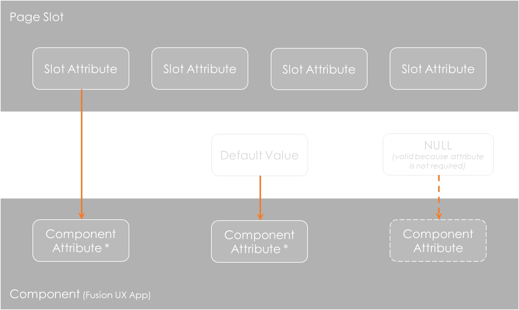
The values are finally assigned when the component gets rendered.
Example Implementation of 'Hello World App'
This example app is integrated into the system in the timeline slot (in the MAPL calendar). The rendered result looks like this:
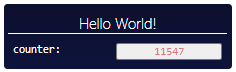
The component displays two attributes:
- title (greeting and name)
- number (increasable via a counter, by clicking on it)
Code for the component (Javascript)
'use strict';

const template = document.createElement('template');
template.innerHTML = `
<style type="text/css">
    <!-- css style -->
</style>
<div class="hello-world-wrapper">
    <h1 class="fux__title"></h1>
    <div class="attribute_wrapper">
        <h1 class="attribute_name">
            counter:
        </h1>
        <button class="attribute_value fux__counter"></button>
    </div>
</div>
`;

export default class HelloWorldComponent extends HTMLElement {
    constructor() {
        super();

        this._root = this.attachShadow({ mode: "closed" });
        this._root.appendChild(template.content.cloneNode(true));
        this.increaseCount = this.increaseCount.bind(this);
    }

    connectedCallback() {
        // fetch the attributes defined in the manifest file
        this.number = parseInt(this.getAttribute('fux-start-number')) || 0;
        this.title = 'Hello ' + (this.getAttribute('fux-name') || 'Fusion UX Logic') + '!';

        this._root.querySelector('.fux__counter').addEventListener('click', this.increaseCount)

        this.renderData();
    }

    renderData() {
        const main = this._root.querySelector('.hello-world-wrapper');
        main.style.display = 'block';

        // include the attributes into the template
        this._root.querySelector('.fux__title').innerHTML = `${this.title}`;
        this._root.querySelector('.fux__counter').innerHTML = `${this.number}`;
    }

    increaseCount() {
        this.number += 1;
        this._root.querySelector('.fux__counter').innerHTML = `${this.number}`;
    }
}
Manifest file
{
    "name": "Hello World component",
    "version": "1.0",
    "author": "Meret Unbehaun",
    "description": "Simple hello world component",
    "tagName": "fux-hello-world",
    "license": "BRANDMAKER",
    "attributes": [
        {
            "name": "fux-start-number",
            "type": "NUMBER",
            "description": "Initial number of the counter",
            "required": true
        }, {
            "name": "fux-name",
            "type": "STRING",
            "description": "Name that will be displayed after 'Hello', by default: Fusion UX Logic",
            "required": false
        }
    ]
}
Installation and Integration
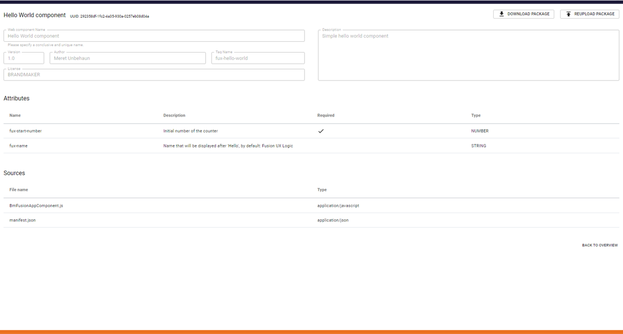
After registering the bundled app like shown under Management, its detail page should look like this:
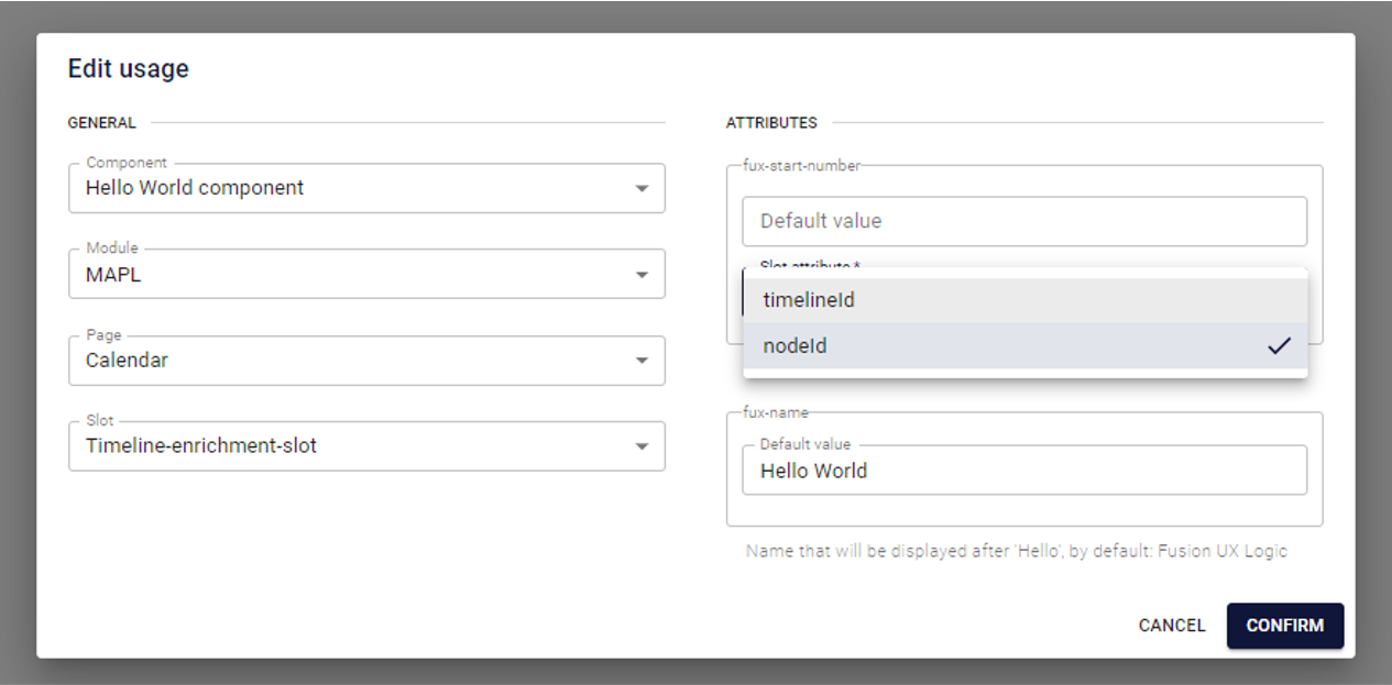
As an example, the timeline node in MAPL is used to display the component. The filled-out form for the newly defined usage looks like this:
Some notes about the attributes and their assignments:
- The default value is used, if no other value is available
fux-nameonly has the default value- Therefore, the attribute will always have this value
- Because the attribute is not required, it would also be valid to leave this field empty
- The timeline slot provides two arguments itself:
timelineIdandnodeId- Both are of the type NUMBER and thus can only be assigned to a NUMBER attribute
- In this example, it can be assigned to the component attribute
fux-start-number
The code for the rendered component (inside MAPL) looks similar to this:
<!-- the placeholder (predefined slot) -->
<div id="timeline_popover_component_holder" class="timeline_popover-cmp">

    <!-- the rendered component (fetched from automatically associated URL) with the assigned arguments -->
    <fux-hello-world
        fux-component-code-base-url="/rest/frontend/web-components/<UUID>/_download-file"
        fux-name="World"
        fux-start-number="8693">

        <!-- the root for the shadow DOM -->
        #shadow-root (closed)
            <!-- style and html structure from inner html -->
            <style type="text/css"> <!-- ... --> </style>
            <div class="hello-world-wrapper" style="display: block;"> <!-- ... --> </div>

    </fux-hello-world>
</div>